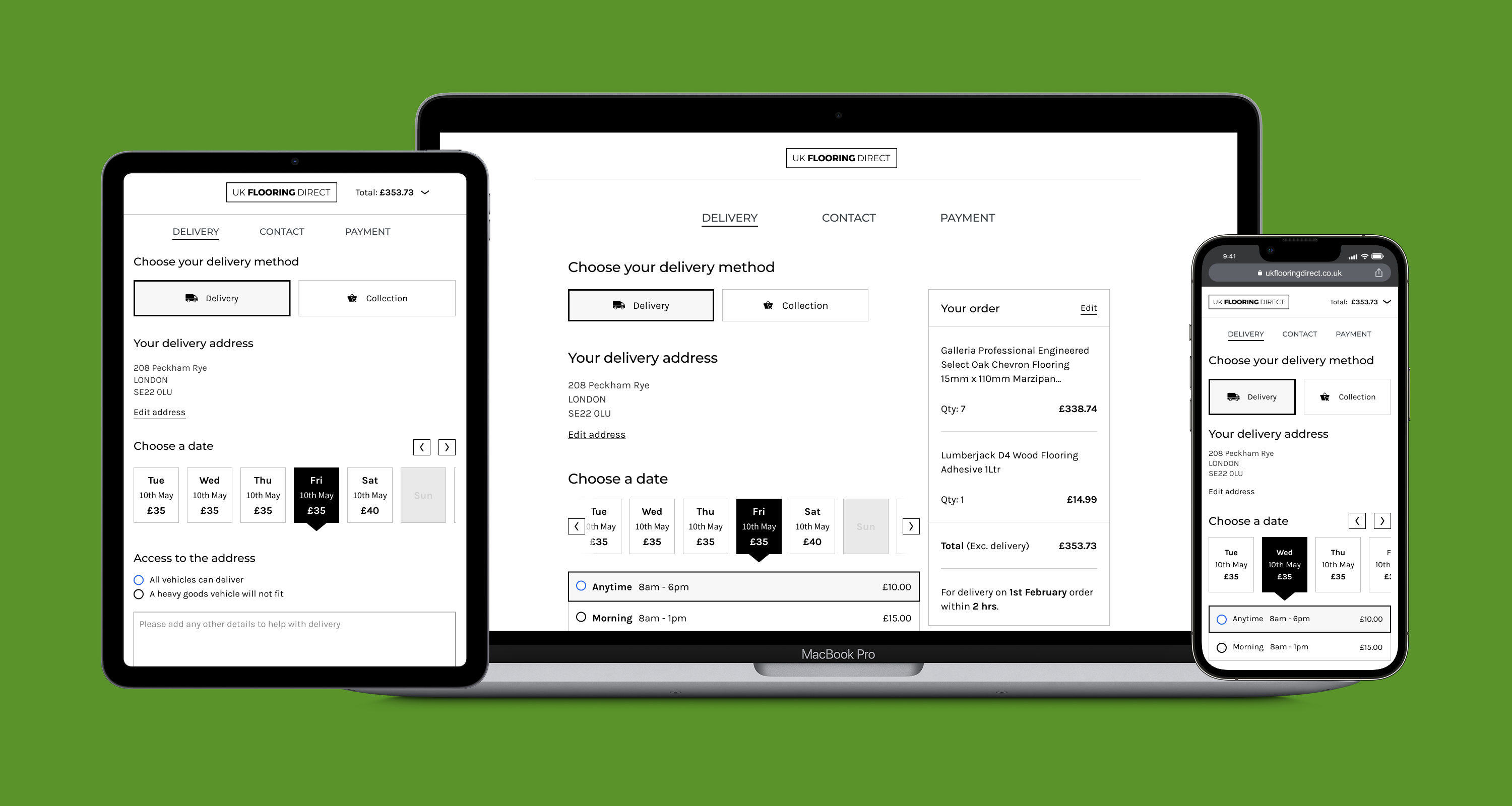

UK Flooring Direct (UKFD) is one of the leading online retailers for flooring products in the UK with a turnover of around £35 million.
The objectives for the redesign were to differentiate themselves from a plethora of competitors, drive greater engagement, and ultimately increase conversion with a more efficient checkout flow.
This was a fast paced project with tight deadlines. We undertook generative research to understand customer behaviours, absorbed large volumes of analytical data, and conducted in-depth analysis to identify solutions.
I was brought in to lead the UX/UI for the new product. I reported to the CDO and managed a UX researcher and UI designer. Activities included:
4 weeks
From kick off to new checkout design
98%
Positive reviews in testing
3%
Reduction in drop-off
To ensure we were solving the right problem, I worked alongside a researcher to plan and recruit participants for customer interviews.
We decided on 3 cohort groups - UKFD retail customers, UKFD trade customers and competitor retail customers - and undertook twenty-eight interviews. The research was intentionally broad, but some of our key aims were to gain an understanding of:
I engaged the analytics team to examine all the key metrics that could help explain user behaviour.
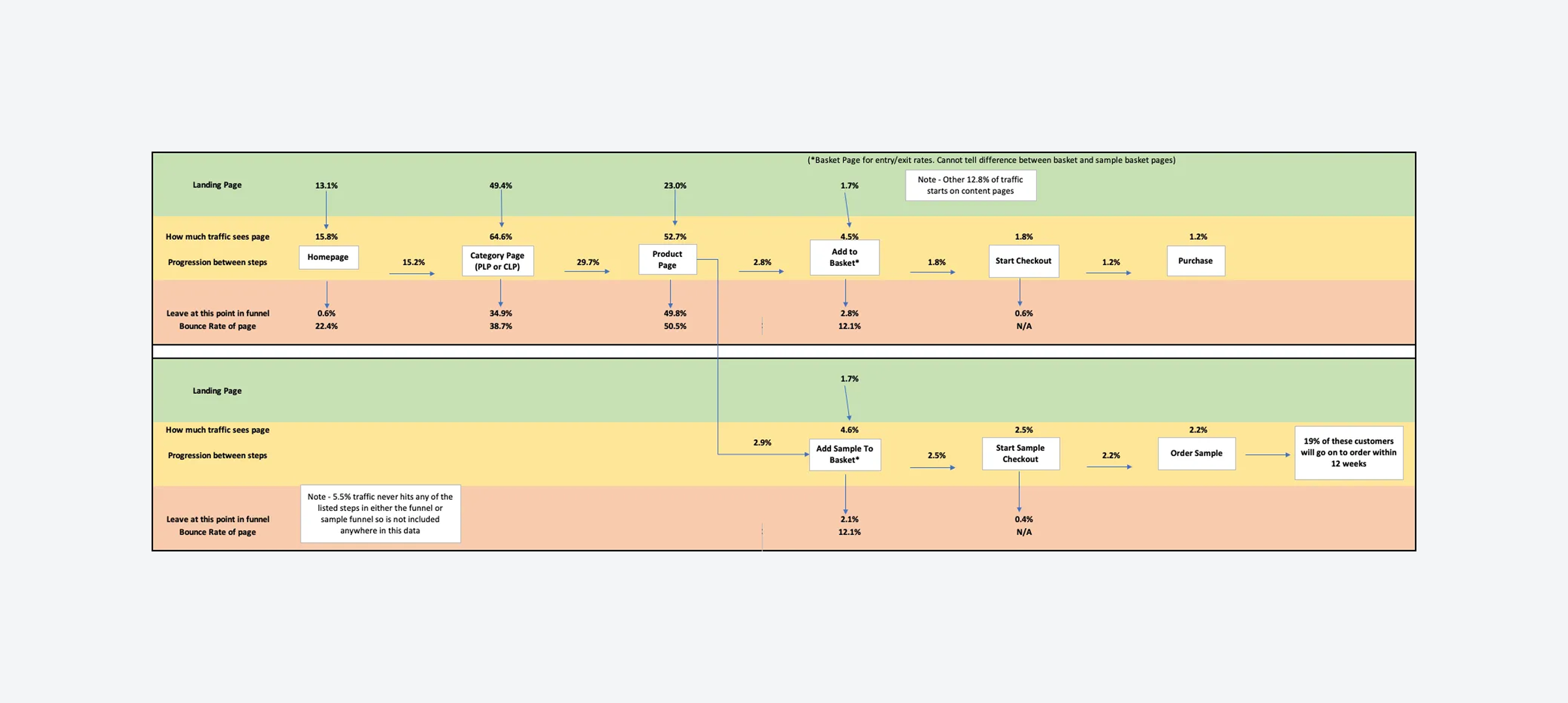
High-level user flows allowed us to see customer entry points, the progression from each step, and, crucially, where they tended to drop out. To gain insights into conversion rates, we undertook an in-depth analysis of the behaviour and interactions on the basket and checkout pages.
The external and internal search term data validated our customer research findings: customers tend to search by room, style (parquet, plank, etc.), and, to a lesser extent, by type (laminate, vinyl, etc.).
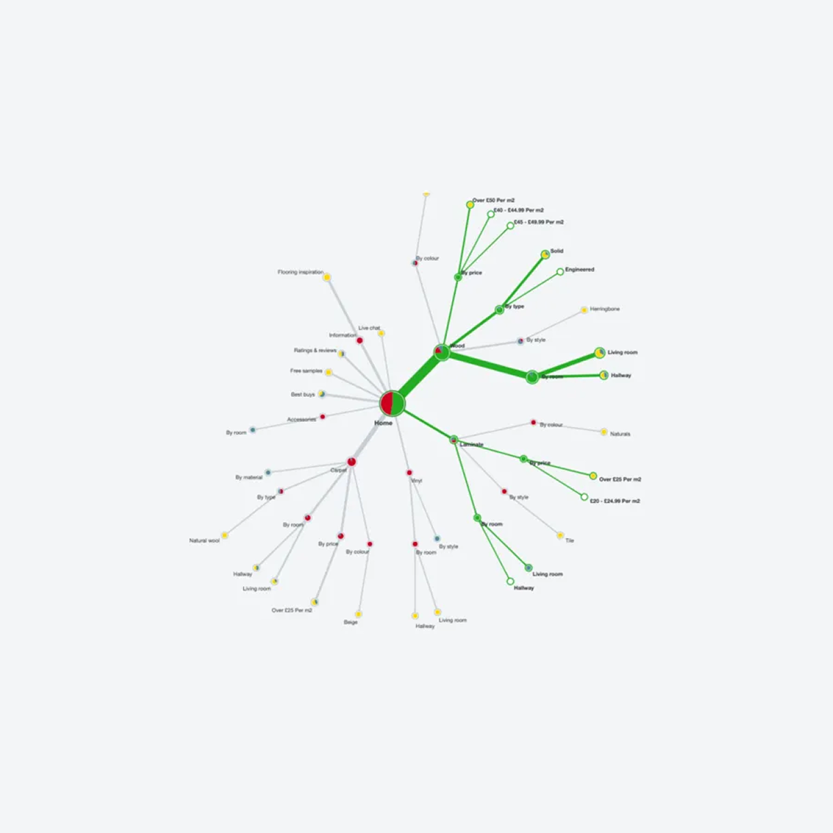
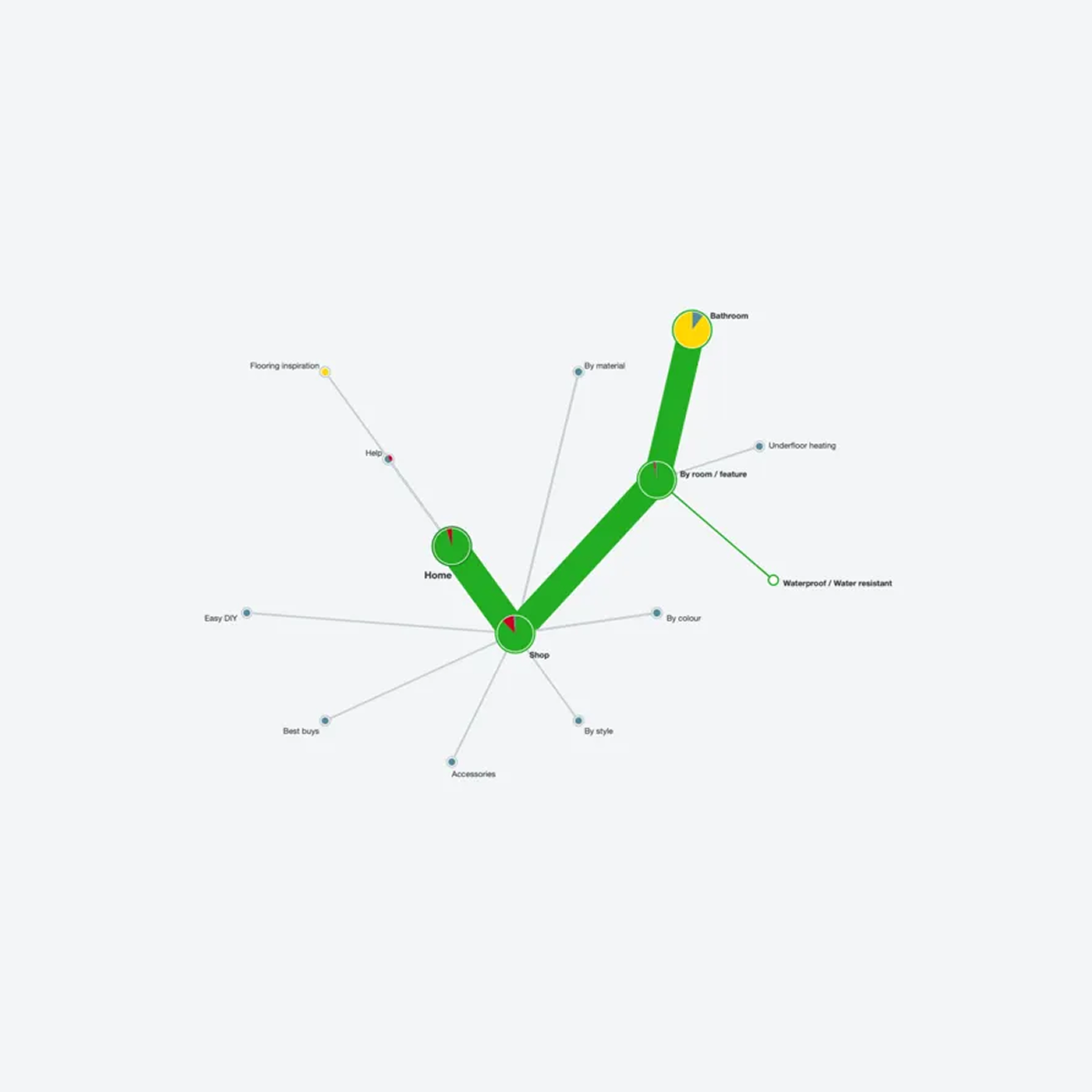
To understand how people categorise flooring, I used Optimal Workshop to evaluate the information architecture and help improve product findability.
After benchmarking the current navigation, I ran several open- and closed-card sorts to understand how customers might conceptualise, group, and label flooring products.
The researcher coded the initial interview feedback, and together, we grouped the codes and defined the themes. We kept refining the themes until we were happy we had answers to as many of the research goals as we initially set out. Some key themes were:
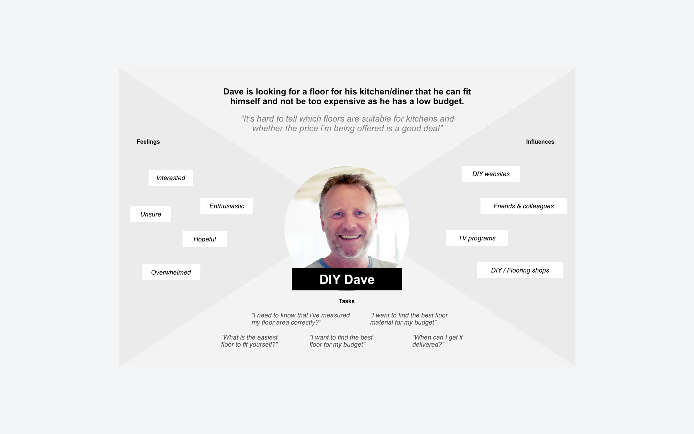
We used adapted empathy maps to crystallise the customer research (see Paul Boag). We chose empathy maps over personas because they focus on user goals and behaviour, making them helpful for quick, informed design decisions.
We had four retail and two trade customer maps. They were sent to all stakeholders and directors in the business so they could relate to the design decisions made.
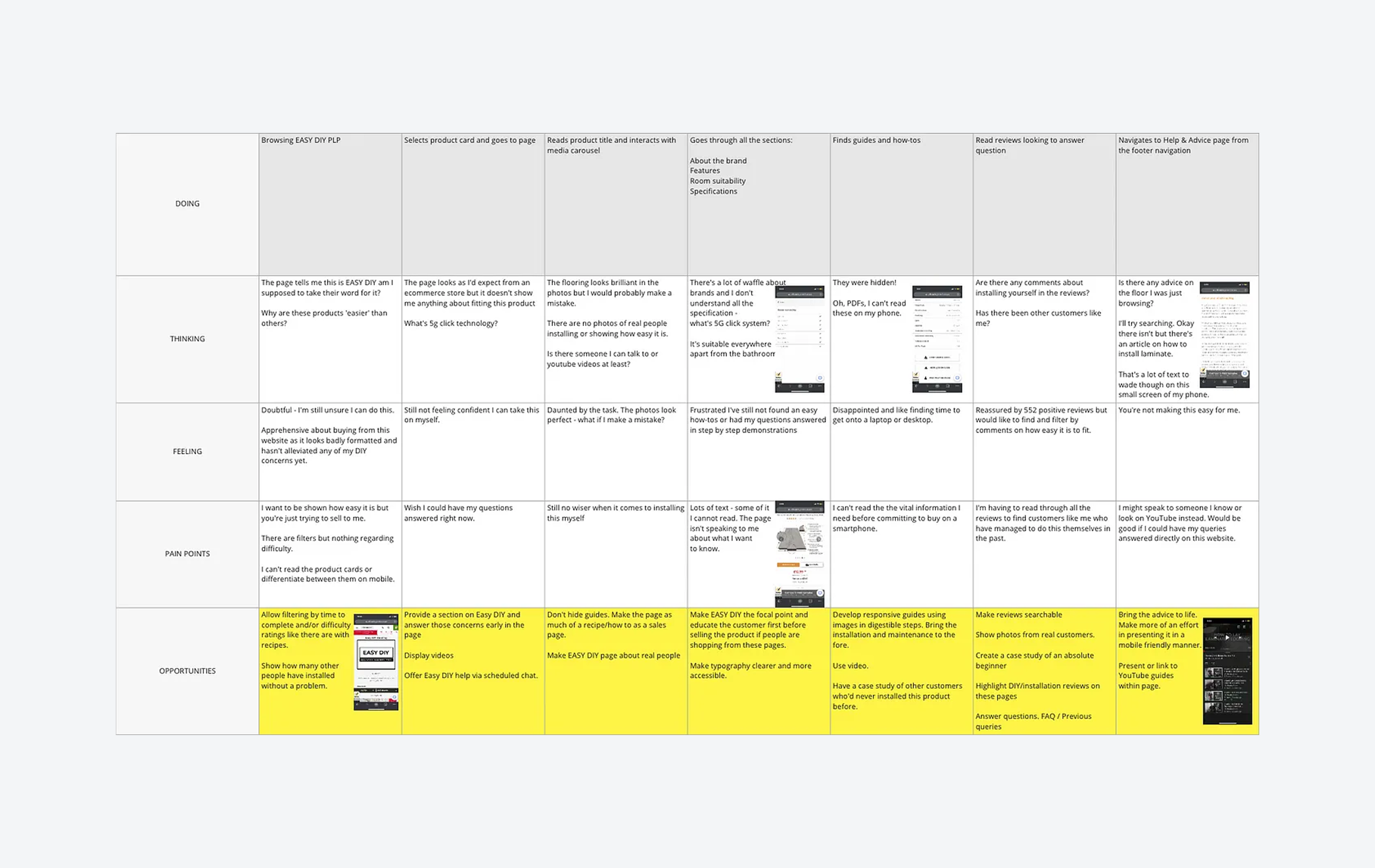
To identify opportunities based on the customer's problems and needs, we mapped themes onto the thinking, feeling, and pain-point lanes of lo-fi user journey maps.
For each empathy map, we created sample and purchase journeys. We then held workshops with the UX/UI and product teams to brainstorm opportunities.
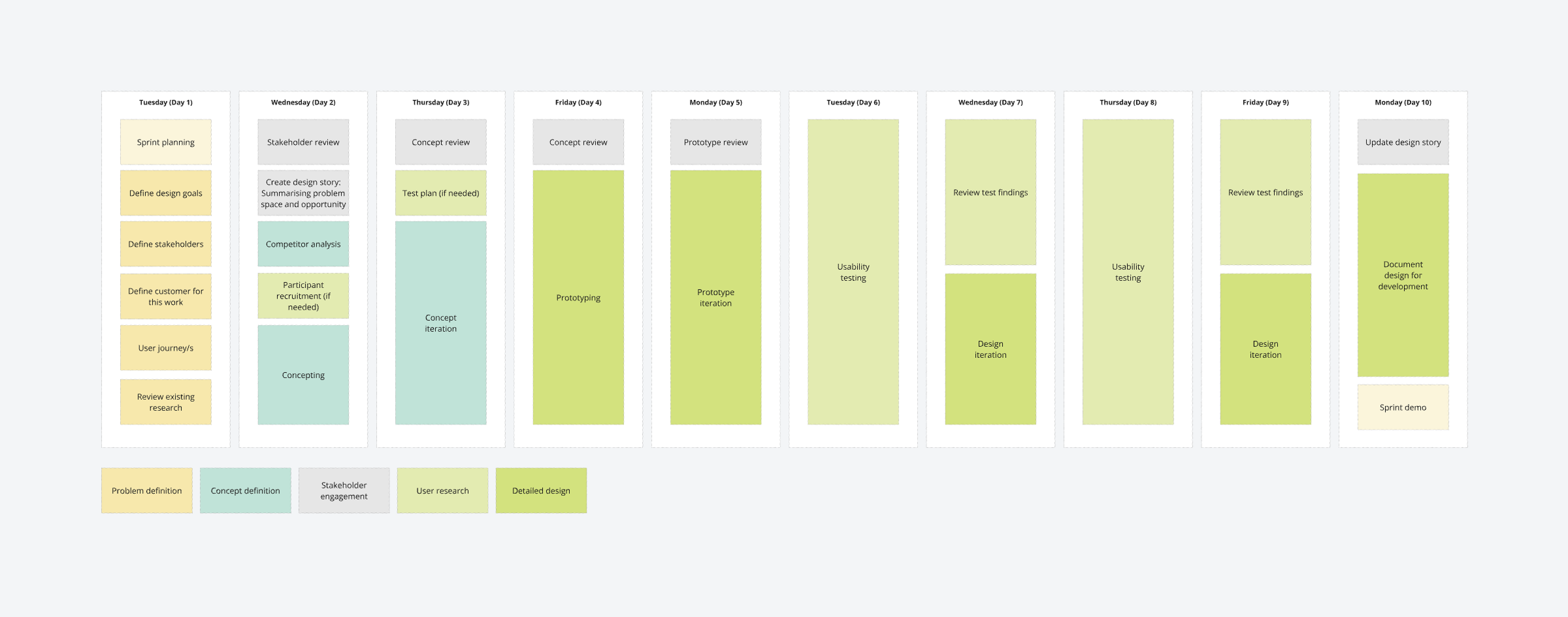
An aggressive UX/UI roadmap was planned and aligned with the wider business delivery schedule and the product owners roadmap.
It was divided into the following workstreams: checkout, view product/add to basket, finding products, engage and inspire, and account management. We then broke these streams into smaller chunks to fit into the delivery plan and 2-week design sprints.
We decided on 2-week design sprints to allow for a more structured approach to defining, concepting, prototyping, reviewing, and user testing.
They were iterative, intense, and rapid! We got a lot done in these sprints, but 2 rounds of testing were too ambitious; this was reduced to 1 round after the first 2 sprints.
Research had provided us with a clear set of problems and needs that customers faced with the existing checkout. We also reviewed Hotjar recordings of customers using the checkout that backed this up; they had problems with the long single-page checkout screen and accessing the correct delivery costs and options, particularly on mobile devices. Defined design goals for the checkout were:
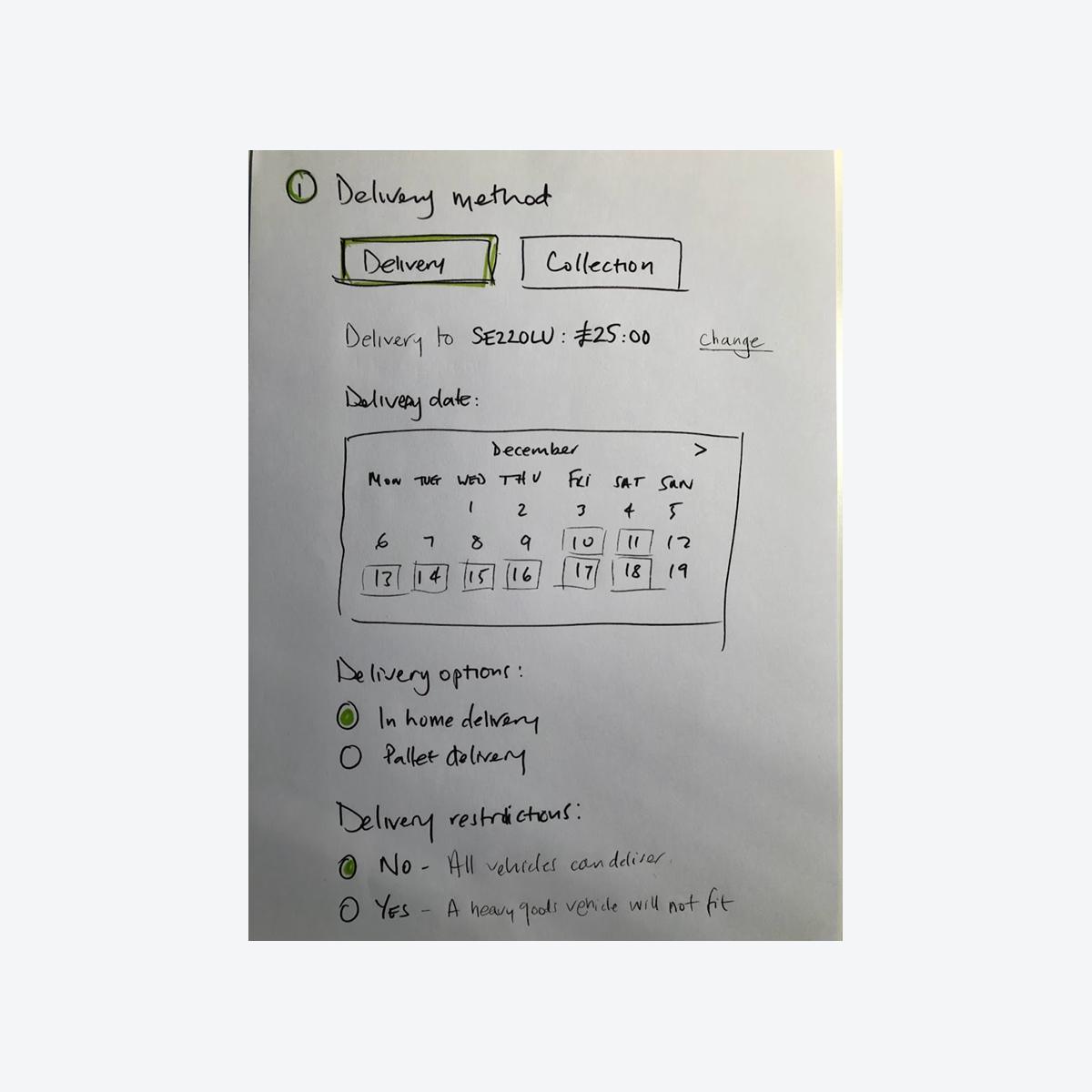
Firstly, I broke down the basket and checkout process into stages and components based on the required information and the customer tasks. This helped me understand what was needed without being constrained by a ‘standard’ checkout flow.
The initial concept revolved around a delivery option mechanism shown to customers at the basket step. This was tested (unmoderated) on usertesting.com, feedback was the screen was creating cognitive overload - “too much going on” - and they wanted to use the basket as a wish list to store possible purchases (our analytics data confirmed this was happening on the site).
The next iteration was an accordion-style checkout that chunked the information in sections, moving to the next section when you had completed the current one. This tested positively on desktop but not on mobile devices, as some customers got ‘lost’ when trying to go back to edit information.
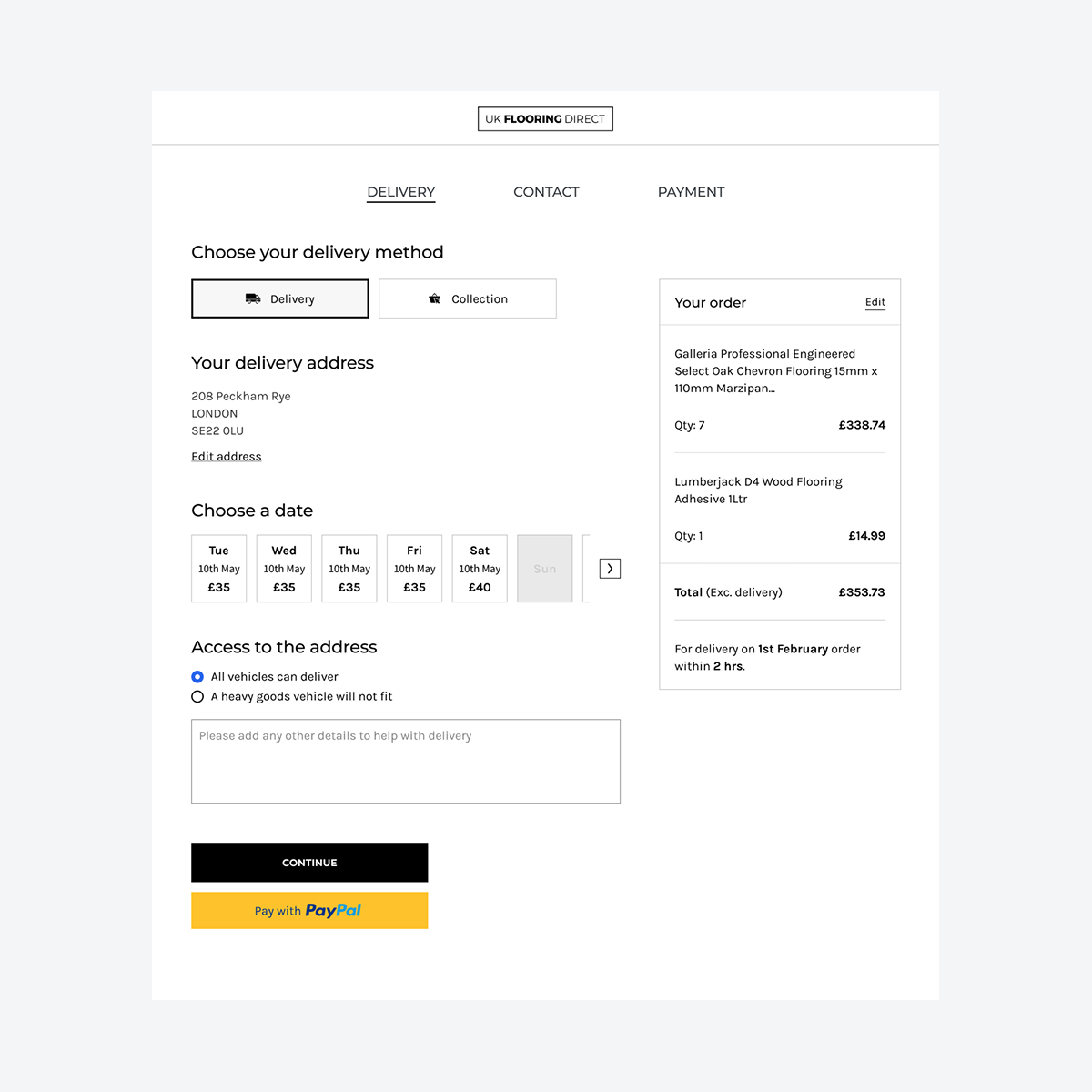
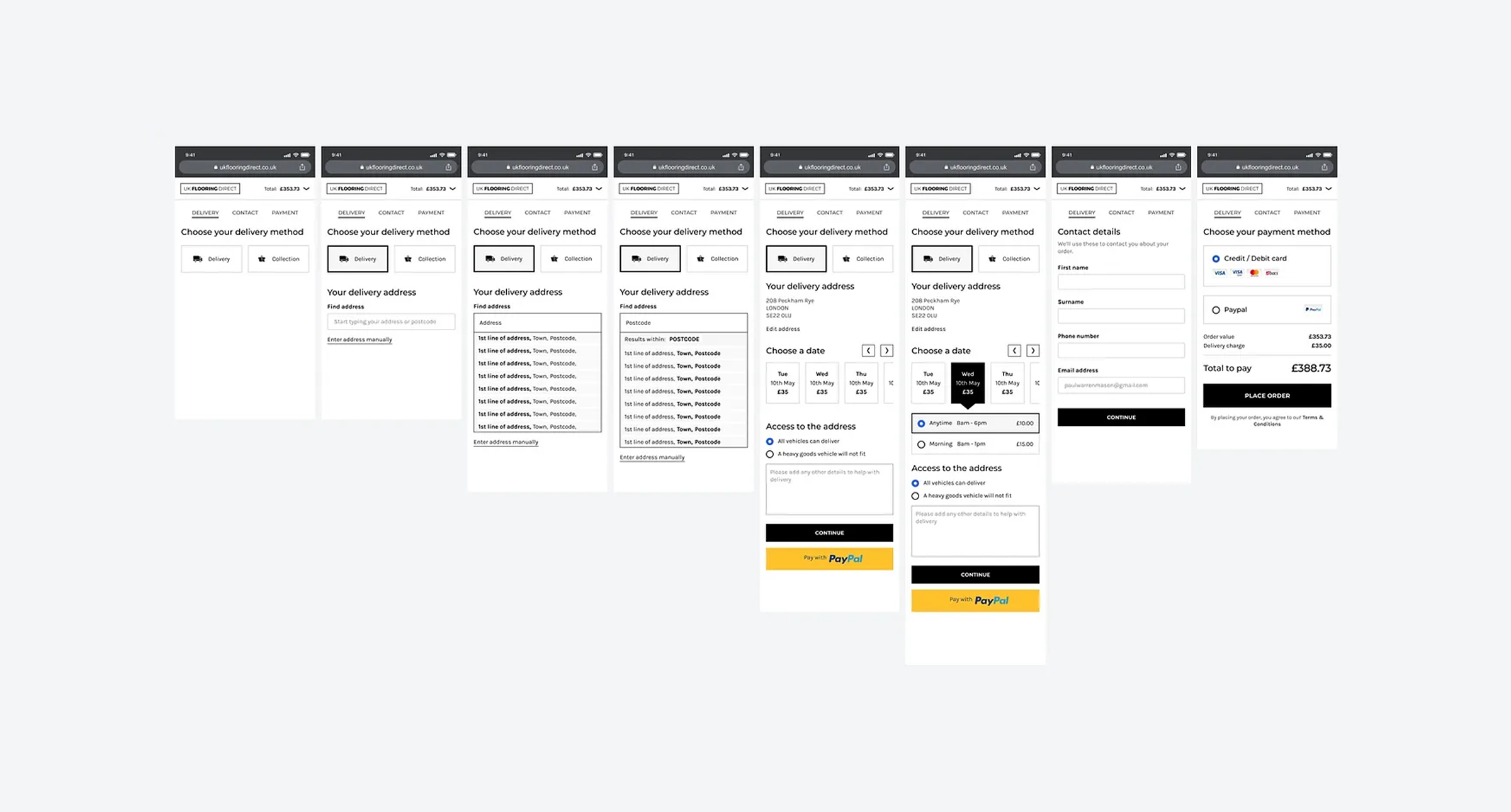
The final solution kept the basket and checkout as separate entities, and the checkout flow became a series of steps, with the delivery mechanism as the first step. This allowed the delivery options and costs to be displayed as quickly as possible and simplified the complete checkout process.
