Simplicity
A streamlined experience throughout the app, reducing clutter, only essential information.
Thomas Cook Airlines (TCA) is the Thomas Cook Group's charter and leisure airline, flying primarily to Europe, the Caribbean, and North America.
The key business goals for the app were to enhance the effectiveness of customer service and increase post booking ancillary sales.
By reframing the objectives to focus on the customer, the new app successfully delivered increased efficiency, deeper engagement, and additional revenue.
I led the UX side of the project from its inception. Reporting directly to the Head of Product, I was responsible for the output of a UX designer and managing the relationship with the external research agency. Activities included:
+9%
Increase in revenue over web
To better understand our customers, I worked with Fluent Interaction to plan and run four focus groups. This gave us an understanding of the key phases and external factors influencing specific tasks and the challenges faced within the customer journey.
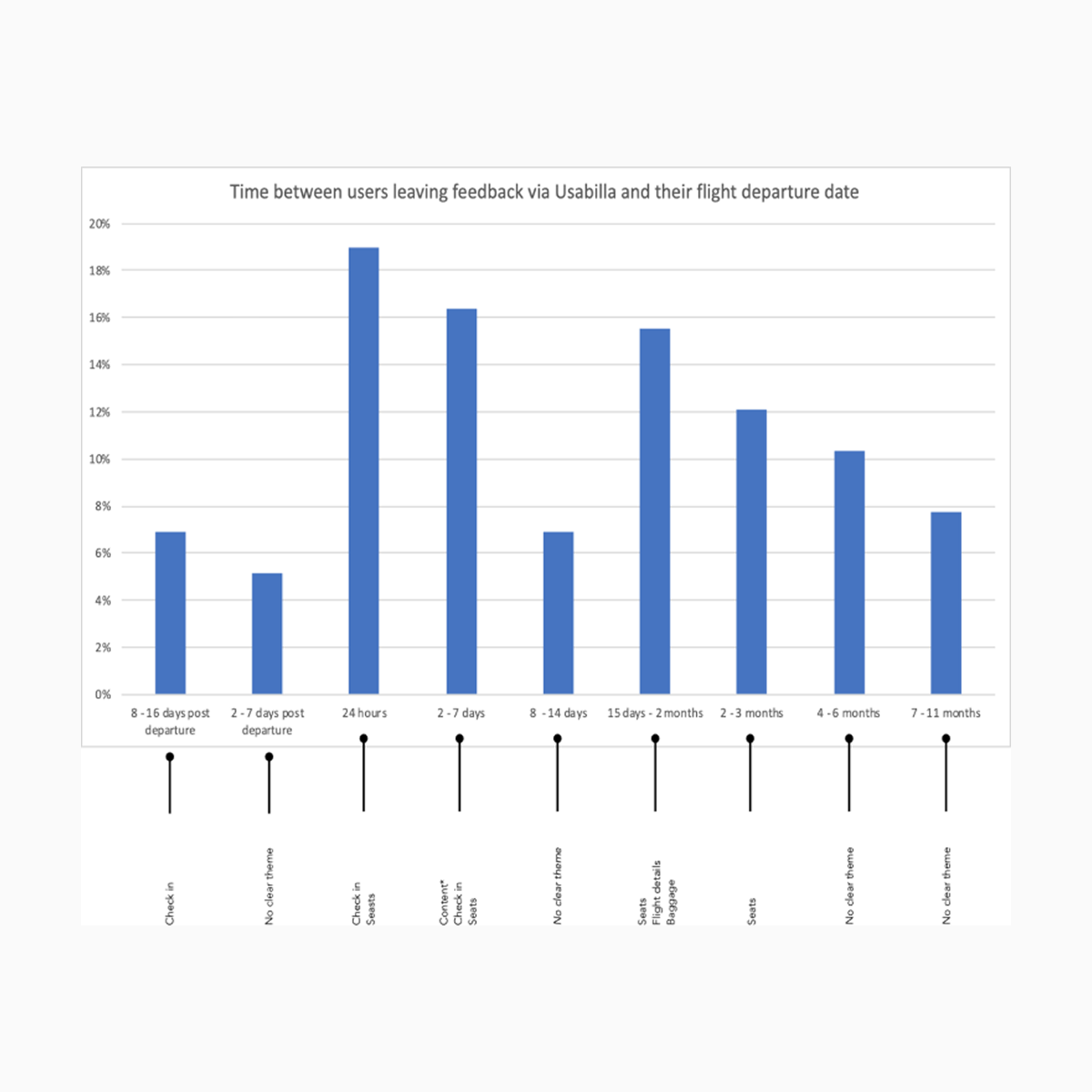
Customer feedback from the Usabilla (now SurveyMonkey) insight platform and site analytics highlighted customer pain points in critical areas (flight details, check-in, seats, baggage, API) and identified essential ancillaries and when they tended to be purchased.
A competitor review of airline and non-airline travel apps was completed and examined innovation, features, conventions, and differentiation opportunities.
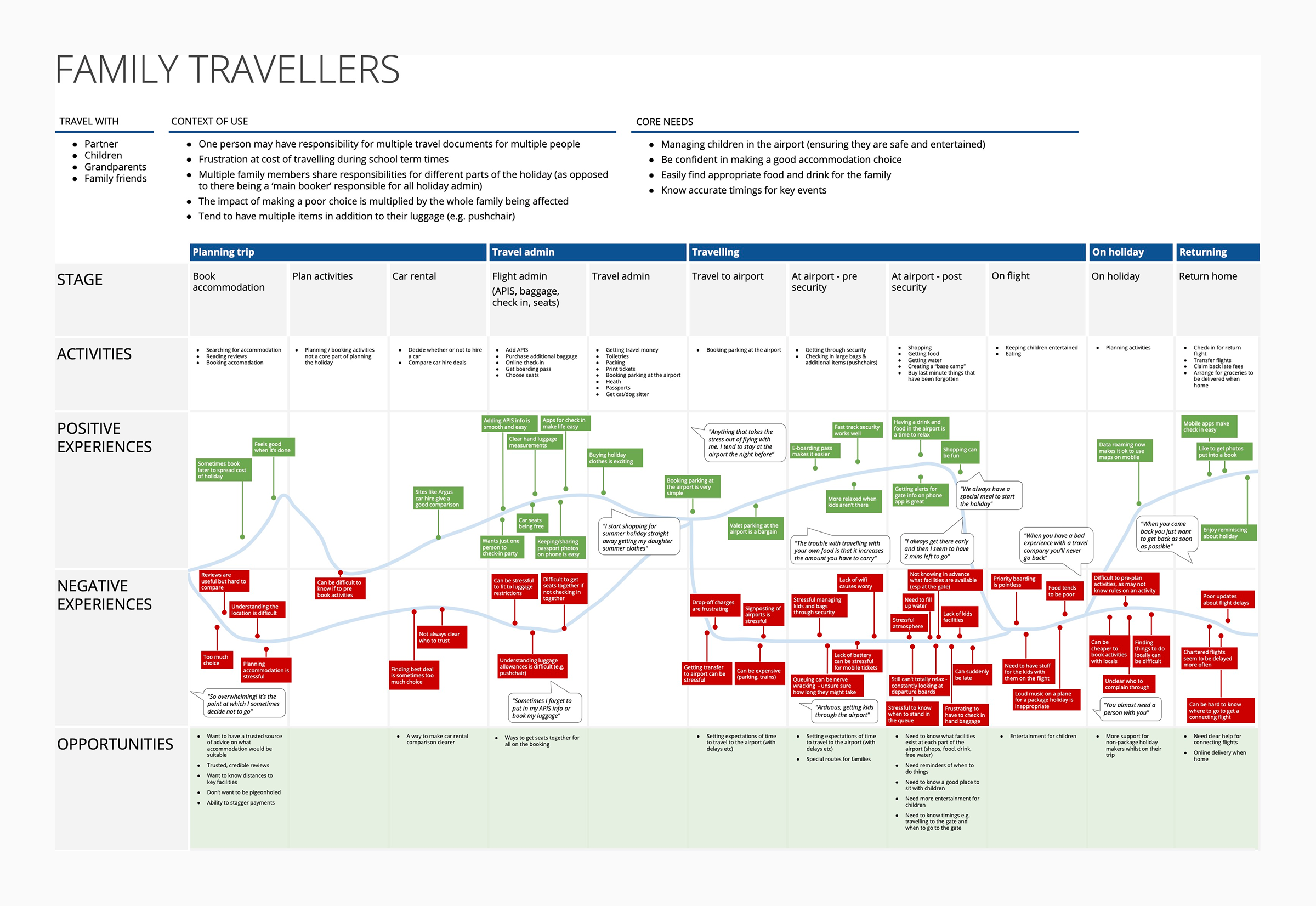
Experience maps were developed for three core traveller segments: families, young individuals, and older adults. These maps captured context, core user needs, key challenges, and highlighted pain points, enabling us to pinpoint opportunities.
The experience maps, Usabilla feedback, and analytics data enabled us to plot a timeline of the peak activity for task completion and accessing trip details, i.e., when customers needed to perform specific tasks or access trip details.
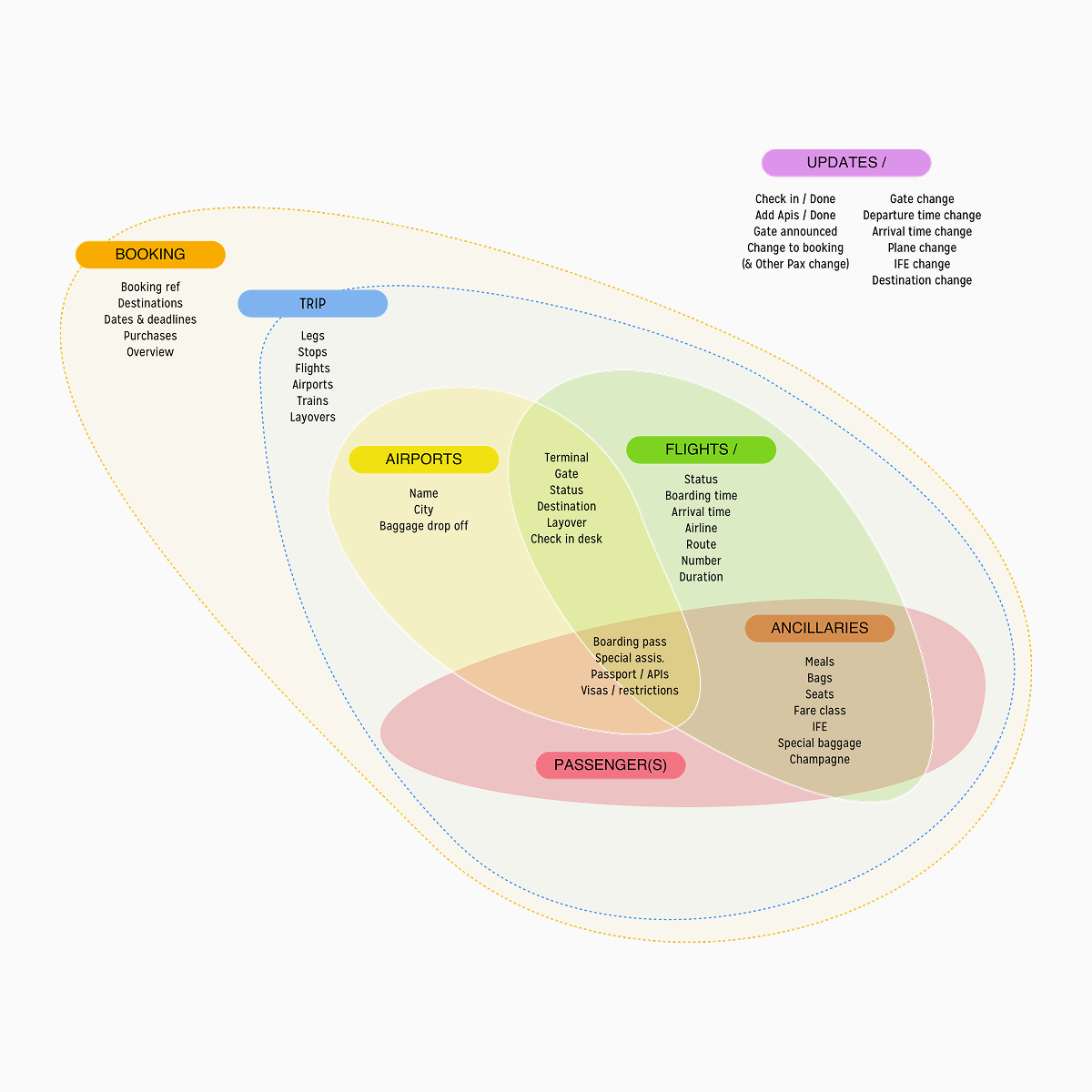
The data requirments for the tasks and details were mapped to an information model. This facilitated discussions with the engineering team on how we were going to access and display the data.
Finally, to ensure our findings and insights were easily digestible and effective for generating design ideas and understanding stakeholder viewpoints, we converted them into "how might we" questions.
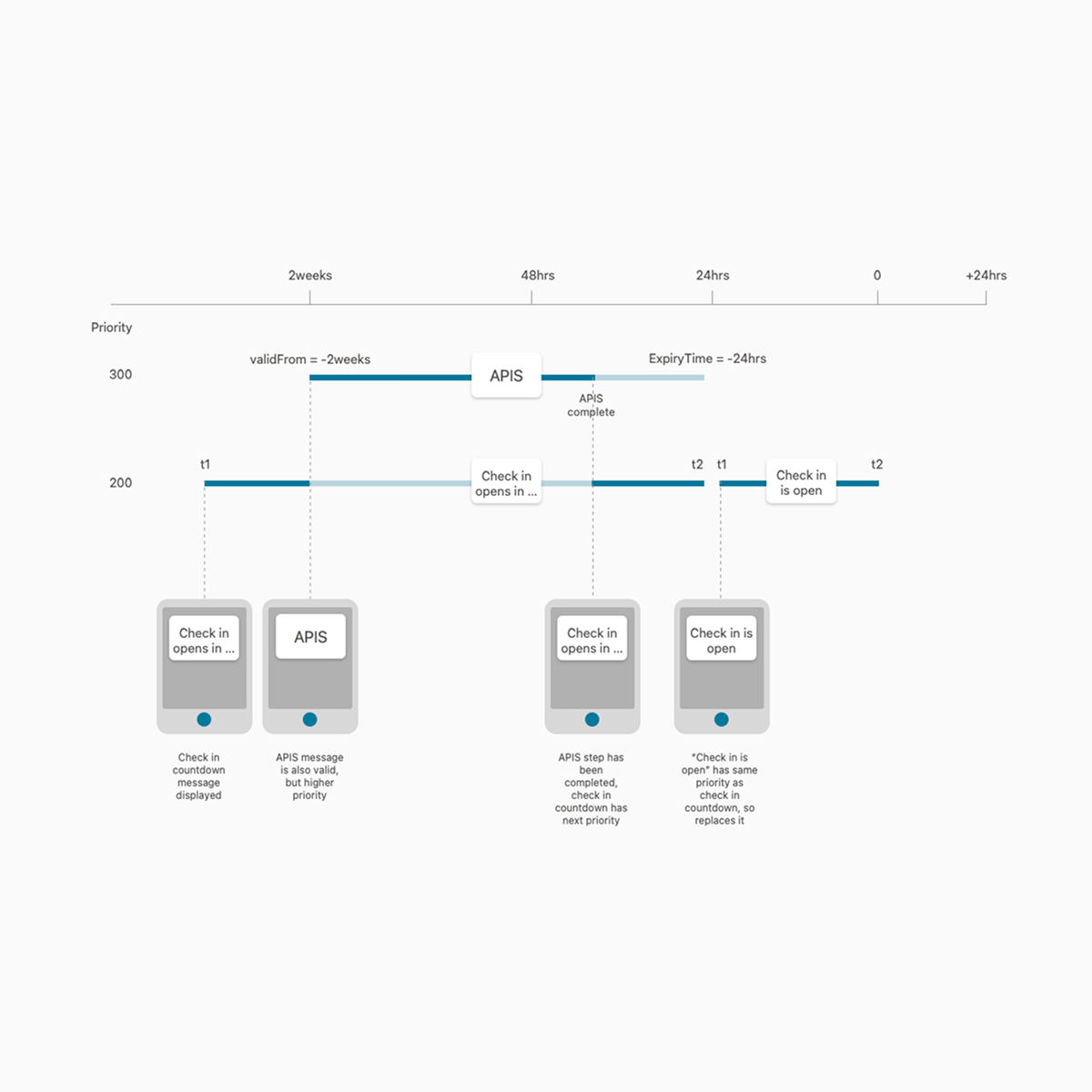
Discovery had revealed the customer journey was fairly linear - booking, preparing for and then undertaking the trip. We knew that communicating the time-sensitive information and tasks that passengers need to know and complete would be a vital component of the final solution.
We used the timeline of peak activity to map a framework for these customer needs. This developed into an elegant system for delivering information when passengers most needed it, and a core conceptual foundation of the design.
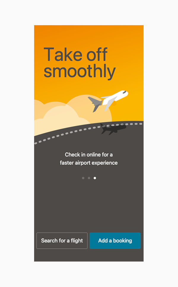
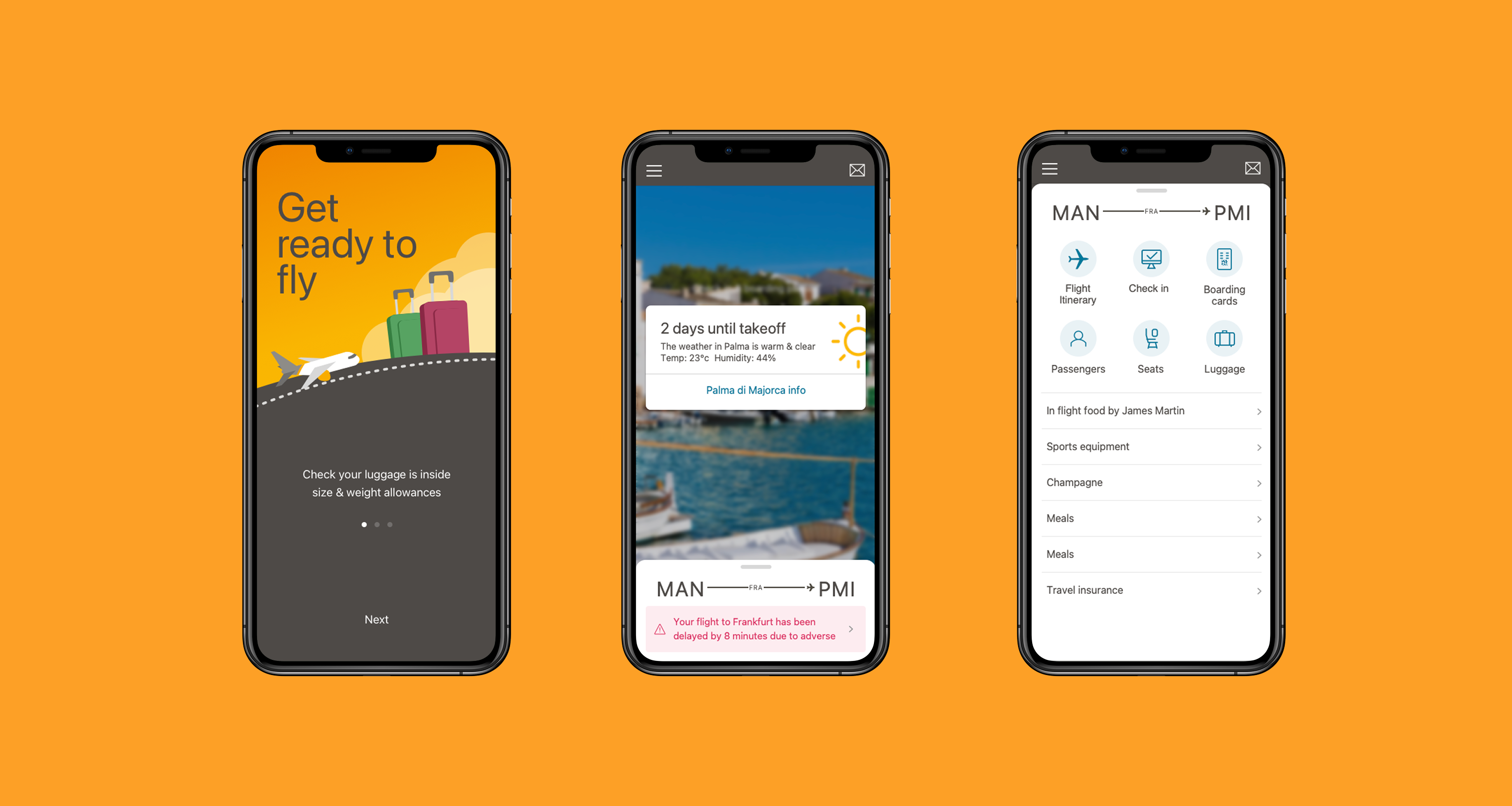
The interface centred on action cards, which provided passengers with vital information and a call to action where necessary.
The cards are delivered in line with the framework and according to the journey and travel requirements. The most critical or mandatory cards are displayed first using a prioritisation system, ensuring the most salient card is always in focus - passengers can always answer the question “What do I need to do next?”.
To reduce the amount of information and clutter in the app, we used a hub-and-spoke navigation model, with the booking details being the hub rather than the flight, as per most airline apps.
This enabled us to display single ancillaries across a booking (multiple flights) with one tap rather than navigating to a flight and viewing all ancillaries for that flight.
Secondary activities such as switching bookings, booking flights, contact details and settings were placed behind the burger menu, helping to increase the focus on the booking and add-ons.
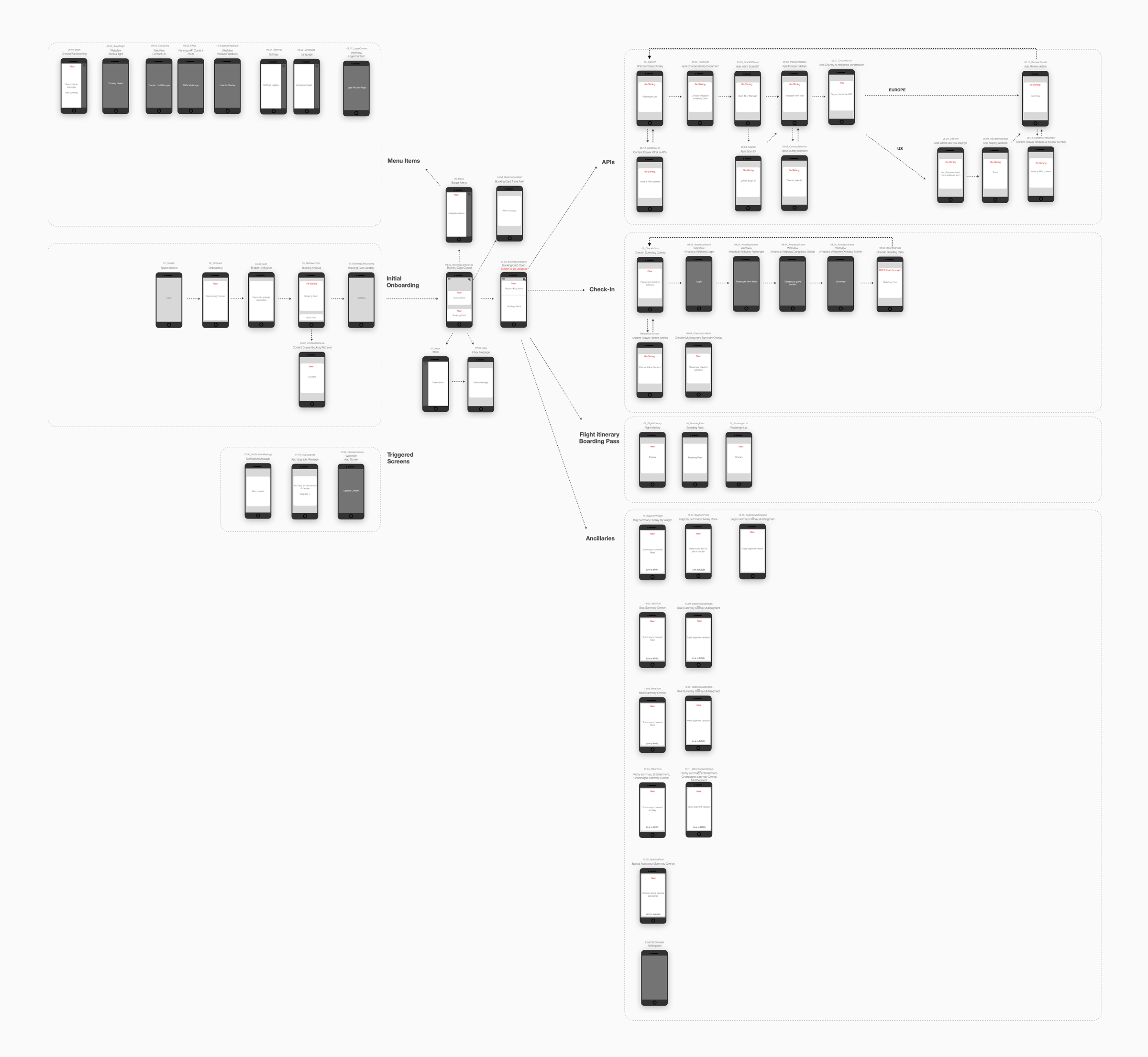
Initial ideas grouped content around the customer journey, with a bottom navigation that divided content into pre-flight, airport, and in-flight. We realised that it made no sense for the passenger to switch between these modes manually - it should be intelligent enough to do it automatically.
The second iteration displayed flight cards in a horizontal carousel. CTA’s for tasks appeared at the bottom of the card, and disappeared when they were no longer required. Flight information was displayed in the card and updates or changes were communicated here. The flight cards quickly became overly cluttered and in testing users became unsure where to find the details.
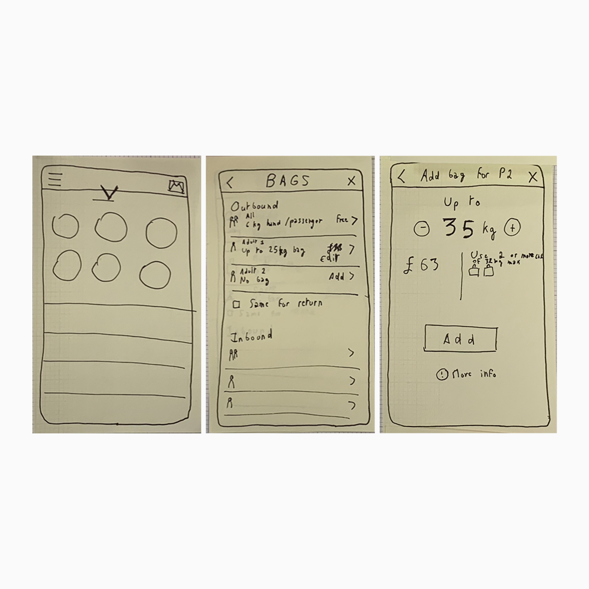
Various attempts to present the booking details (flight details, seat numbers, baggage allowances and meals) tested badly due to the complexity behind outbound/inbound legs, fare inclusive/extra allowances and connecting flights. After many iterations, we produced a design that passengers could easily understand.
Testing showed that users understood the action cards and were reassured they would receive the correct information at the right time.
Initially, users were troubled because they couldn’t see all the booking details “in one place”, but after using the design pattern of overlays to quickly jump in and out of the ancillaries on the booking, they saw the advantage of not being overwhelmed with information and data.
Although the overlays worked well for direct flight itineraries, they didn’t test as well for bookings with connecting flights served by a different airline. These are subject to different business rules, and users often miss the distinction between flights.
A streamlined experience throughout the app, reducing clutter, only essential information.
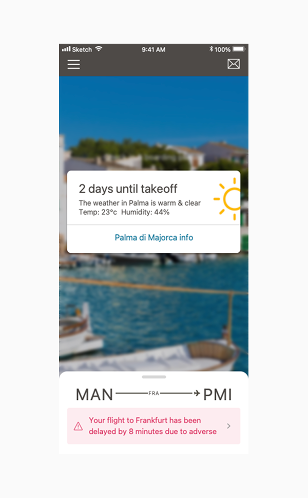
Action cards delivered information when it was needed, booking details in the bottom sheet.
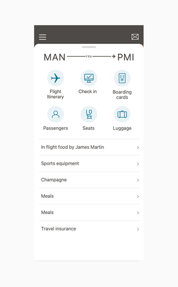
All the booking details and ancillaries accessible in one place.
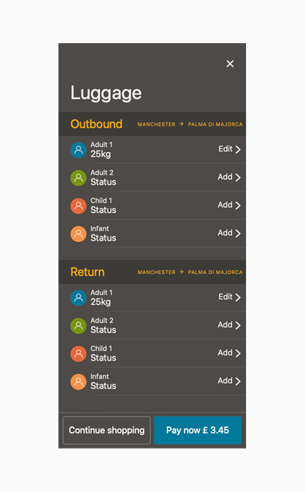
Add any required ancillaries for the booking and not just the flight.